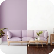
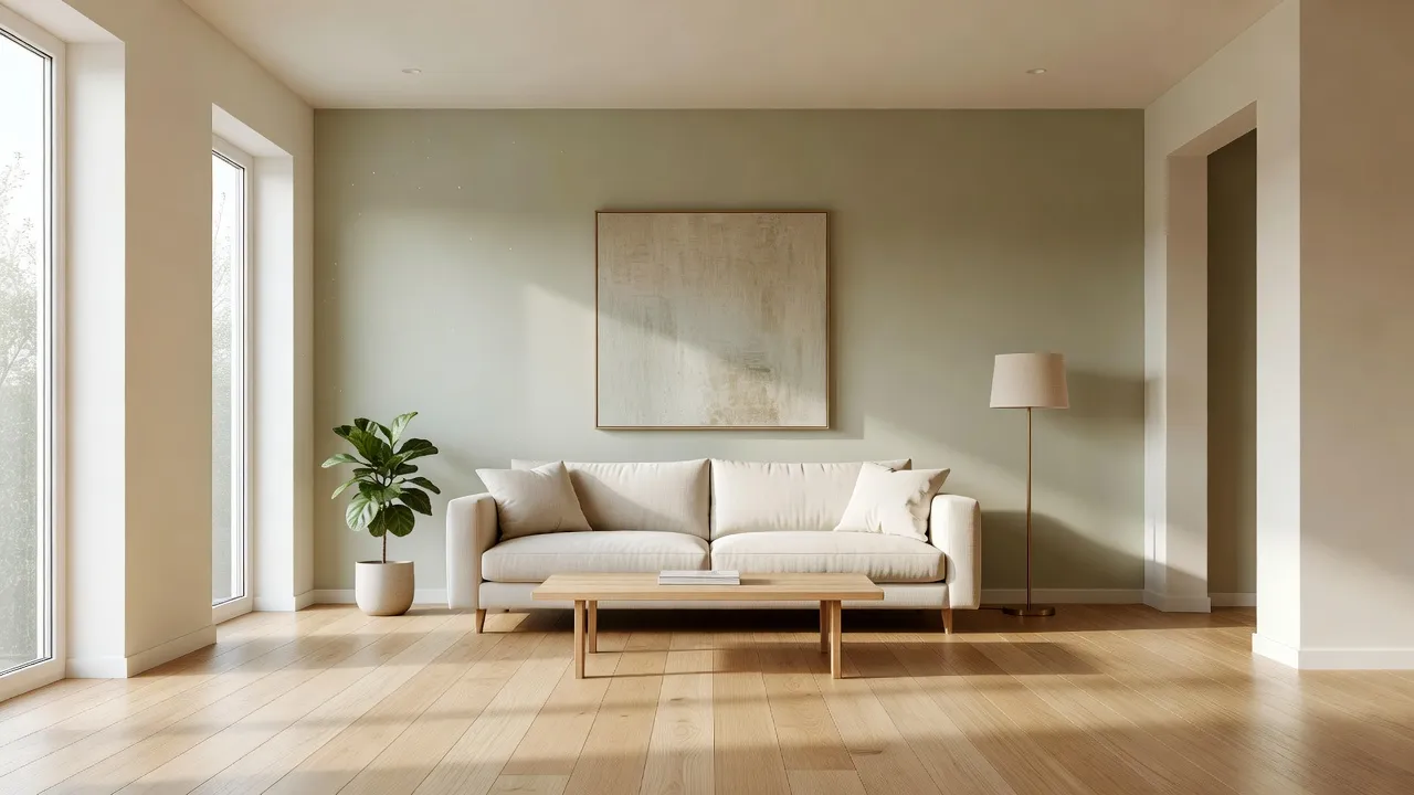
The best living room wall colors balance natural light exposure with undertones that match your furniture, with warm off-whites, muted sage greens, and grounded earth tones dominating residential spaces in 2026. Choosing the right wall paint requires evaluating your room's orientation, light reflective value (LRV), and existing fixed finishes before buying paint gallons.
Selecting paint seems simple until a swatch of light gray turns stark icy blue under north-facing sunlight, or a creamy white looks dingy beige under warm artificial lighting. The most common mistake homeowners make is choosing paint colors directly under harsh fluorescent store lighting without testing them inside their actual living rooms.
Mistaking color temperature leads to costly repainting projects. Re-painting an average 300-square-foot living room runs between $400 and $1,200 in materials and labor, making proper pre-visualization critical before opening a single paint can.
What are the living room wall color trends for 2026 according to interior designers?
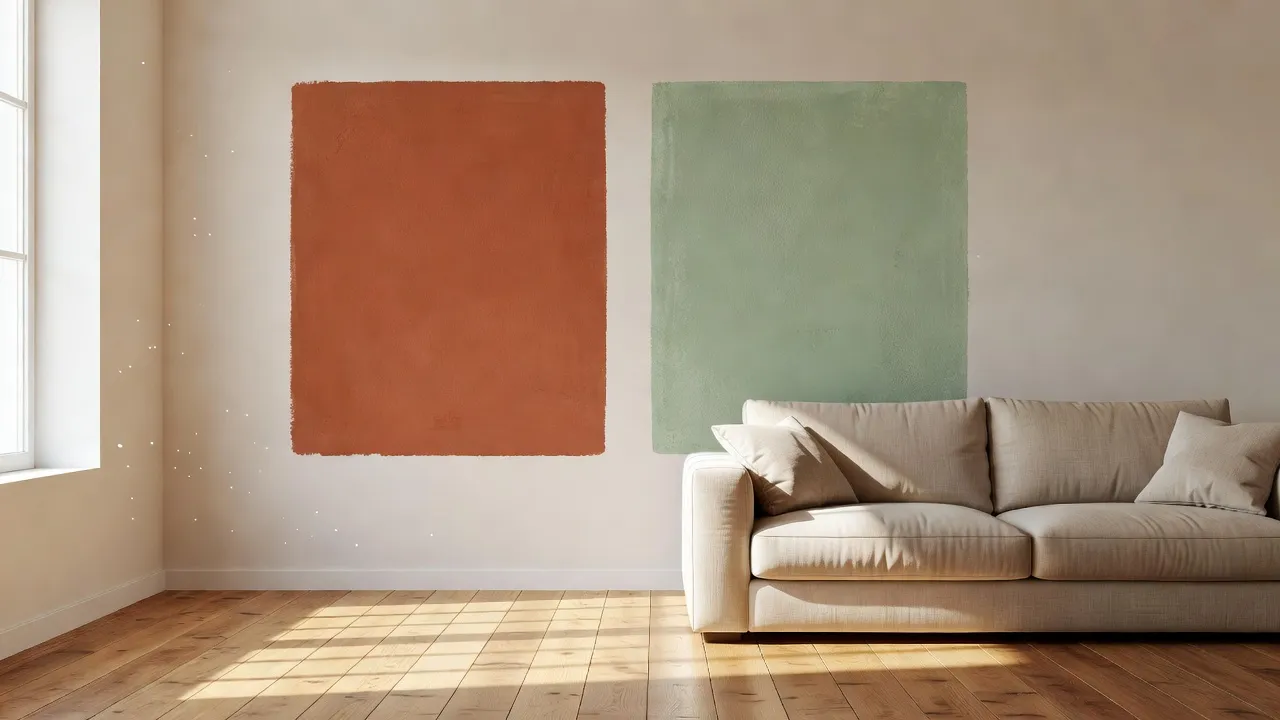
Interior designers in 2026 are shifting away from cool grays in favor of warm mid-tones, muddy earth shades, and enveloping monochromatic palettes. The dominant trend prioritizes cozy, tactile spaces using colors that contain brown, yellow, or red undertones to make gathering spaces feel grounded.
Designers report three major movement shifts for living room walls this year:
- Earthy Terracotta and Warm Ochre: Rich clays and muted rust shades are replacing cool accent walls, adding depth to rooms with generous natural light.
- Desaturated Botanical Greens: Soft moss, muted olive, and greyed-out sage act as new neutrals, bringing organic outdoors inside without overwhelming architectural elements.
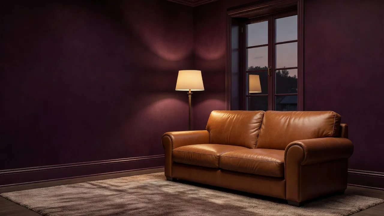
- Color-Drenching in Enveloping Darks: Painting baseboards, trim, walls, and doors in the exact same low-sheen dark tone (like deep plum or stormy navy) creates seamless room boundaries.
Setting your color scheme around fixed furniture pieces prevents clash. If you want to explore how modern furniture pairs with earthy palettes, exploring modern interior design principles helps align wall choices with overall space planning.
What is Benjamin Moore's 2026 Color of the Year for the living room?
Benjamin Moore's dominant 2026 palette centers around cinnamon-infused earths and nuanced off-whites like Simply White (OC-117) and Soft Chamois (OC-13), prioritizing subtle warmth over clinical whites. While official annual announcements vary across collections, their core forecast highlights adaptable mid-tones that soften living room lighting variations throughout the day.
According to color data on the official Benjamin Moore color trends resources, warm off-whites with a Light Reflective Value (LRV) between 70 and 80 form the foundation for modern living spaces. Shades like Swiss Coffee (OC-45) and Paper White (OC-55) allow natural light to bounce off walls while preserving warm undertones during evening hours under 2700K lighting.
When applying Benjamin Moore neutrals in a living room:
- Use an Eggshell or Matte finish on main walls to hide minor drywall imperfections.
- Pair warm walls with Satin or Semi-Gloss trim in a clean off-white like Chantilly Lace (OC-65) for subtle structural contrast.
- Keep ceiling paint flat to prevent reflection glare from overhead canned lighting.
What are Sherwin-Williams' 2026 color trends for the living room?
Sherwin-Williams emphasizes restorative neutrals, grounded clay tones, and deep moody blues across their 2026 living room color collections. Their color forecasting highlights shades that build relaxed atmosphere, moving away from high-contrast stark pairings.
Key living room paint choices from Sherwin-Williams include:
- Alabaster (SW 7008): A legendary warm white that provides softness without leaning overly yellow.
- Shoji White (SW 7042): A versatile hybrid white-greige that stabilizes high-contrast dark wood flooring.
- Evergreen Fog (SW 9130): A chameleon green-gray that adds quiet sophistication to formal living areas.
- Naval (SW 6244): A deep navy used frequently for fireplace accent surrounds or library-style living rooms.
The primary error when selecting Sherwin-Williams paints is ignoring LRV ratings. A dark shade like Naval has an LRV of 4, meaning it absorbs 96% of ambient light. Using it across a windowless living room without multi-layered lamp lighting will make the space feel cramped.
What is Pantone's 2026 Color of the Year for living room colors?
Pantone's color directions for 2026 center on organic, comforting tones that bring quiet luxury and sensory warmth to living spaces. Pantone's influence spreads across soft textiles, accent decor, and architectural paint formulations aimed at living rooms.
To translate Pantone's global palette into functional wall paint, paint stores match these shades into interior latex formulas:
- Velvety Warm Earths: Translated into rich mocha or warm taupe wall paints that anchor minimalist leather seating.
- Soft Mineral Blues: Translated into chalky blue-gray living room walls that balance warm oak floors.
- Sun-Drenched Apricot Neutrals: Applied as gentle accent colors on alcoves or architectural archways.
Pantone shades are specified in RGB and Pantone Matching System (PMS) codes, which differ from architectural paint swatches. Always request a custom computer match at a paint shop rather than picking an off-the-shelf approximate match.
What living room wall color trends does Architectural Digest recommend for 2026?
Architectural Digest recommends matte wall finishes, tone-on-tone trim pairings, and rich warm neutrals that complement natural materials like linen, travertine, and oiled oak. Their editorial features highlight living rooms that avoid glossy wall paints and stark cool blues.
As published across recent design showcases on Architectural Digest, leading designers emphasize these practical rules:
- Eliminate stark white trim: Paint baseboards and crown molding two shades darker or lighter than the wall, using the same hue family.
- Embrace lime wash and Roman clay: Textured mineral finishes give living room walls natural depth and subtle shade variations.
- Match wall color to light orientation: Avoid forcing bright whites into dark spaces; lean into cozy mid-tones in dimly lit rooms.
Scenario 1: Low-Light North-Facing Living Rooms
North-facing living rooms receive cool, blue-tinted natural light throughout the day, requiring paint colors with clear warm undertones to prevent walls from looking gloomy. Cold grays or blue-based whites in north-facing light will look dull and clinical.
Best Paint Strategies for North Light
- Select warm-tinted off-whites: Colors with peach, cream, or yellow undertones compensate for the cool exterior light.
- Avoid stark cool whites: Pure whites without undertones look grey and muddy under northern exposure.
- Lean into rich mid-tones: If natural light is minimal anyway, deep warm shades like terracotta, mustard, or deep olive turn lighting limitations into cozy atmosphere.
Testing colors virtually saves effort before slapping paint swatches onto dark plaster. Using tools built for ai room design lets you preview how different warm undertones handle low light conditions in your actual room layout.
Scenario 2: Open-Concept Living Rooms Connected to Kitchens
Open-concept spaces require a unified wall color strategy to prevent chaotic visual transitions between cooking, dining, and seating zones. Painting open areas five different colors visually breaks the floor plan and makes the space feel smaller.
Open Concept Wall Color Flow
The wall color flows in sequence from kitchen zone to dining zone to living zone.
| Zone | Wall Color | Notes |
|---|---|---|
| Kitchen Zone | Warm White Cabinets | e.g., SW Alabaster |
| Dining Zone | Main Neutral Wall | e.g., SW Shoji White |
| Living Zone | Accent Zone | 1-2 Shades Darker |
Transitioning Paint Colors Seamlessly
- Choose one anchor neutral: Apply a single light neutral across 70% of the continuous wall surface.
- Use architectural stops for color changes: Only change wall colors where an inside corner, pillar, or wall break exists.
- Vary sheen rather than hue: Keep the color identical but use Semi-Gloss in the kitchen area for scrubbability, and Matte or Eggshell in the living zone.
To check how your continuous open-concept walls will pair with updated decor, browse current room decor ideas to coordinate furniture finishes with your anchor neutral.
Scenario 3: Small Living Rooms Needing Visual Expansion
Small living rooms appear visually larger when walls, trim, and baseboards are painted in a uniform light color with low-sheen finishes. Visual clutter shrinks a room faster than square footage does.
Color Techniques for Compact Living Areas
- Blur room boundaries: Paint baseboards and trim the same color as the walls to remove harsh horizontal dividing lines.
- Use high Light Reflective Values (LRV 75+): High LRV colors bounce ambient light around compact rooms.
- Paint ceilings pure flat white: Drawing the eye upward without reflection reflection gives the illusion of taller walls.
Scenario 4: High-Traffic Family Living Rooms
High-traffic living rooms require paint choices that balance scuff resistance with color forgivingness, avoiding stark whites and flat sheens on lower wall areas. Kids, pets, and daily use reveal smudges instantly on high-contrast dark or flat white surfaces.
Choosing Durable Finishes and Tones
- Eggshell or Satin sheen: These finishes allow routine wiping with a wet microfiber cloth without leaving shiny burnish spots.
- Mid-tone warm neutrals: Warm greiges and soft sage mask light dust and minor wall scuffs far better than stark white.
- Wainscoting or two-tone walls: Paint the lower third of the wall in a darker, washable satin shade, keeping the upper wall lighter.
Scenario 5: Living Rooms with Warm Oak or Dark Hardwood Flooring
Living room wall colors must account for the undertones of your wood floors to avoid aggressive color clashes. Red oak floors clash with yellow-based wall paints, while dark walnut floors absorb ambient light and require balanced wall contrast.
| Floor Type | Ideal Wall Color Pairing | Colors to Avoid |
|---|---|---|
| Honey Oak / Yellow Pine | Soft Sage, Muted Slate, Charcoal | Golden Yellow, Orange Terracotta |
| Red Oak / Cherry Wood | Warm Off-White, Olive Green, Cream | Cool Pink, Cool Icy Blue |
| Dark Walnut / Espresso | Soft Linen, Warm Taupe, Cream | Dark Navy, Muddy Brown |
Living Room Wall Color Decision Framework
Choosing a wall color based purely on a 2-inch paper swatch leads to costly mistakes. The table below matches real living room scenarios with realistic costs and wall color recommendations.
| Living Room Scenario | Core Lighting Need | Best 2026 Palette Choice | Common Paint Traps | Instant Visual Testing Option |
|---|---|---|---|---|
| North-Facing Room | Warmth & Bounce | Warm Off-White (BM Soft Chamois) | Buying cool light grays | Physical Peel-and-Stick Swatch |
| Living Room Wall Visualization | Tone & Furniture Matching | 100+ Styles & Custom Text Prompts | Painting full walls blind | Renova AI App |
| South-Facing Room | Light Balancing | Cool Sage or Greige (SW Repose Gray) | Overly bright yellow-whites | Large Sample Board |
| Open-Concept Space | Visual Continuity | Soft Neutral (SW Shoji White) | Too many accent walls | Color Continuity Map |
| High-Traffic Family | Scrubbability | Satin Finish Warm Taupe | Using Flat paint on low walls | Washable Paint Swatches |
How to Test Living Room Wall Colors Before Painting
Testing paint samples directly on small sections of drywall usually fails because the surrounding old wall color distorts how your eyes perceive the new sample. The existing wall color alters your color perception, causing paint to look completely different once applied across the whole room.
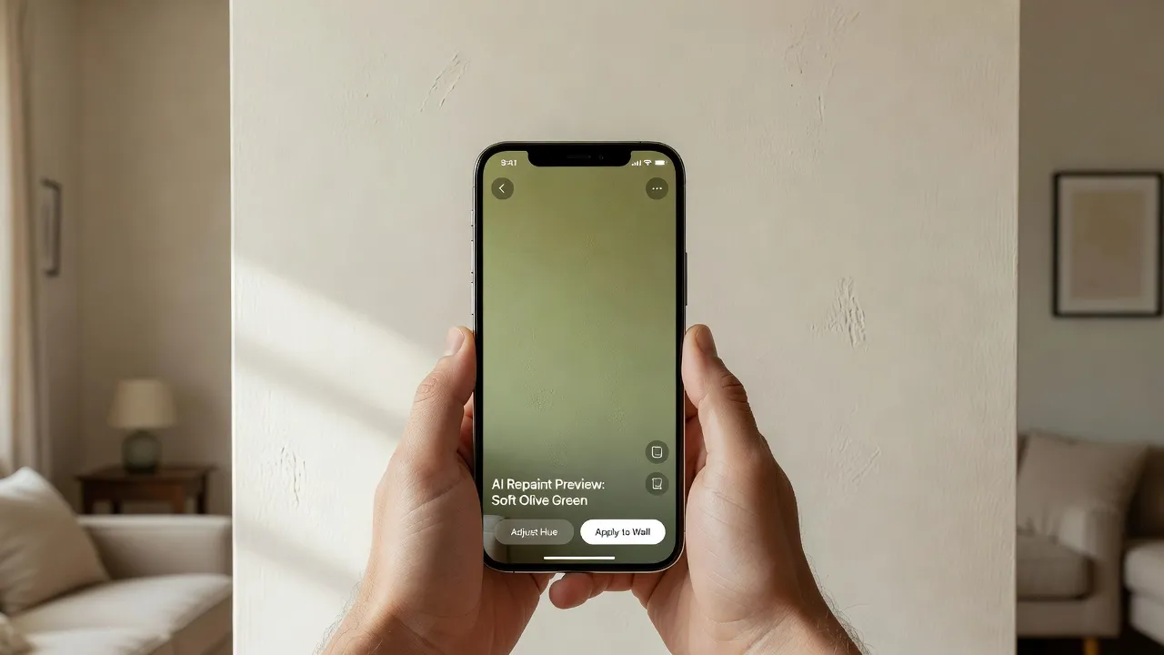
Step 1: Use Digital AI Visualization
Before spending $150 on paint samples and brush tools, capture a quick picture of your current living room. The Renova AI app lets you execute a complete living room wall repaint and floor swap in seconds without manual editing. You can test 100+ design styles—from Japandi to Modern—or input custom requests to see how warm greys or deep terracottas interact with your specific sofa and natural light layout.
Step 2: Use Movable Sample Boards
Never paint swatches directly onto white drywall. Paint two coats of sample paint onto 12x12-inch white foam boards or peel-and-stick sample sheets, leaving a white border around the edge.
Step 3: Move Samples Across Four Walls
Move your painted sample board around the living room throughout the day:
- Morning Light: Check the board on east-facing walls.
- Afternoon Natural Light: Check on west-facing walls under direct sunlight.
- Evening Artificial Light: Place the board next to your floor lamps under warm LED bulb lighting (2700K–3000K).
If you are evaluating complete home upgrades alongside wall colors, comparing professional options on virtual interior design helps set realistic budgets for full room updates.
Frequently Asked Questions
What living room wall color makes a room look larger?
Light off-whites, soft greiges, and muted creams with high Light Reflective Values (LRV 75+) make a living room look larger. Painting baseboards, doors, and trim in the exact same color eliminates visual breaks, stretching room boundaries.
Should living room walls be lighter or darker than the sofa?
Living room walls should contrast with your sofa by at least two shade tones so furniture does not blend into the background. Pair dark leather or charcoal sofas with lighter neutral walls, and light beige or linen sofas with deeper mid-tone accent walls.
What is the most popular living room wall color for 2026?
Warm off-white with warm undertones is the most popular living room wall color in 2026. Homeowners are moving away from cool grays toward organic creams, warm greiges, soft sage greens, and muted terracotta.
How do I pick the right paint sheen for my living room?
Eggshell finish is ideal for living room walls because it offers soft low-sheen depth while allowing light cleaning. Use Flat or Matte finishes for ceilings to hide drywall seams, and Satin or Semi-Gloss for baseboards, doors, and window trim.
Why does my paint sample look different on the wall than in the store?
Paint swatches look different at home because retail store fluorescent lighting differs from home LED bulbs and direct sunlight. Home lighting temperature, existing flooring undertones, and natural room orientation drastically change how paint pigments look.
How can I visualize living room paint colors without painting?
You can visualize living room colors by using mobile AI visualization applications like Renova AI to instantly preview wall repaints on your actual room photo. Alternatively, you can use peel-and-stick paint samples on white foam boards moved around your space.
Should crown molding and baseboards match wall color?
Matching crown molding and baseboards to wall color creates a modern, spacious look through color-drenching. Painting trim in a contrasting off-white satin sheen remains a classic choice for traditional homes with detailed woodworking.
Choosing Your Final Palette
Selecting living room wall colors comes down to testing undertones under real room lighting conditions instead of guessing inside a retail aisle. Start by identifying your natural light exposure, matching wall undertones to your existing hardwood flooring, and previewing palettes digitally before committing to gallon cans.
Testing your favorite shades with the Renova AI app allows you to visualize complete wall repaints instantly alongside your furniture, saving time and preventing costly repainting projects.