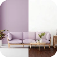
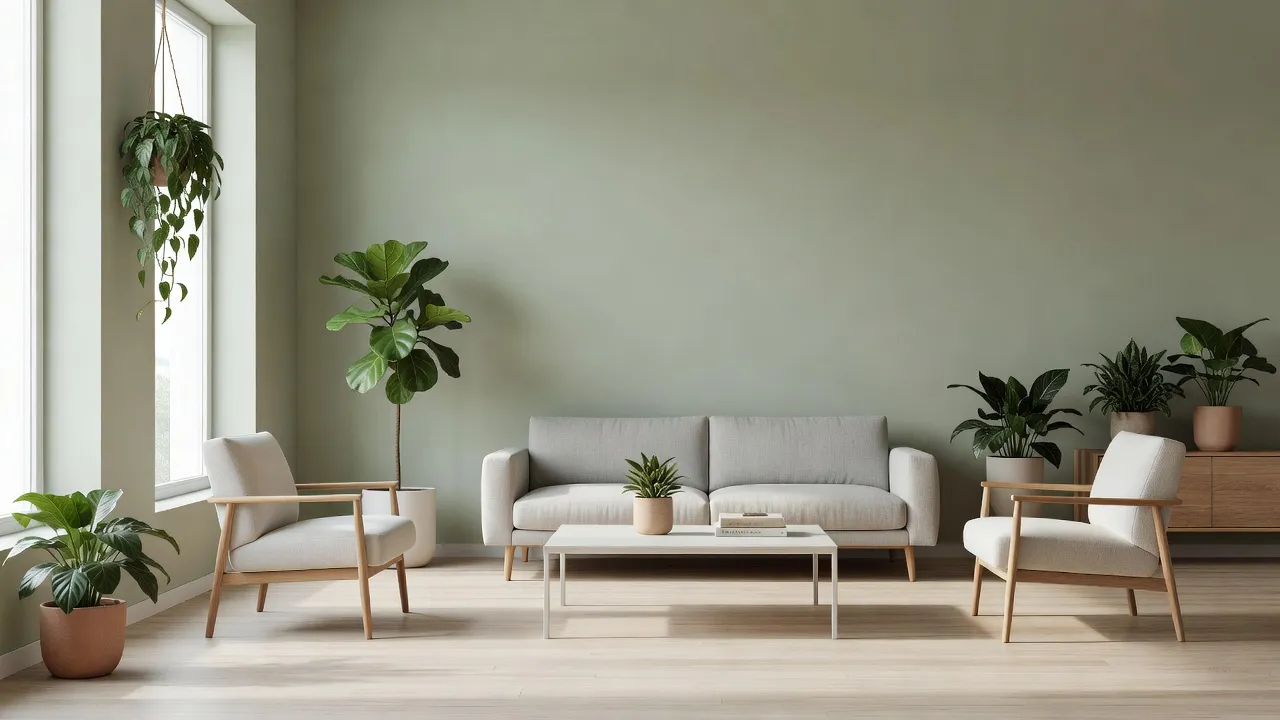
The most popular Sherwin-Williams green paint colors include Evergreen Fog (SW 9130), Sea Salt (SW 6204), Oyster Bay (SW 6206), Clary Sage (SW 6178), Comfort Gray (SW 6205), and Liveable Green (SW 6176). These muted, nature-inspired shades range from soft seafoam neutrals to mid-tone gray-sages. Homeowners choose them because green acts as a organic neutral that pairs effortlessly with warm wood tones, black hardware, and crisp white trim.
Green paint has fundamentally shifted how interior designers approach neutral spaces. Rather than relying on stark whites or cool grays, modern homes lean on desaturated greens to add depth without overpowering a room. However, green pigments are notoriously temperamental. The undertones in a green paint can shift dramatically depending on window orientation, ambient sunlight, and surrounding fixtures.
Understanding a shade's Light Reflectance Value (LRV) and underlying color base is critical before buying samples. According to Wikipedia's entry on Light Reflectance Value, LRV measures the percentage of light a paint color reflects on a scale from 0 (absolute black) to 100 (pure white). A green with an LRV of 63 will feel light and airy, while a shade with an LRV of 30 will absorb light and pull a room inward.
If you want to explore different palette options across your house, checking popular living room wall colors can help you decide where a soothing green fits best.
Comparing Popular Sherwin-Williams Green Colors
Matching the right green paint to your room requires balancing Light Reflectance Value, undertones, and natural light exposure. The table below breaks down the key specs and operational requirements for Sherwin-Williams' top green paint colors, alongside digital room visualization options to streamline your testing workflow.
| Paint Color / Tool | LRV | Undertones | Ideal Room Exposure | Key Limit / Dealbreaker |
|---|---|---|---|---|
| Evergreen Fog (SW 9130) | 30 | Slate Gray, Blue | South / West light | Darkens low-light northern rooms |
| Sea Salt (SW 6204) | 63 | Blue, Cool Gray | North / East light | Flashes bright blue in strong afternoon sun |
| Oyster Bay (SW 6206) | 44 | Slate, Gray, Blue | Balanced natural light | Too heavy for windowless powder rooms |
| Clary Sage (SW 6178) | 41 | Herbal Yellow, Soft Beige | South / Warm light | Pulls dingy brown under 2700K LED bulbs |
| Comfort Gray (SW 6205) | 54 | Cool Slate, Green | Any exposure | Clashes with warm honey-oak trim |
| Liveable Green (SW 6176) | 61 | Warm Gray, Cream | North / Low light | Can lose its green identity in bright sun |
| Renova AI Visualizer | N/A | Interactive preview | Any photo upload | Requires smartphone photo upload |
Note: LRV and paint specification data verified via Sherwin-Williams official color specs in September 2026.
Is Sherwin-Williams Evergreen Fog a popular green paint color?
Yes, Evergreen Fog (SW 9130) is one of Sherwin-Williams' most requested green paint colors. It earned mainstream recognition when selected as the Sherwin-Williams 2022 Color of the Year. It remains a staple for kitchen cabinets, accent walls, and primary bedrooms.
LRV and Undertones
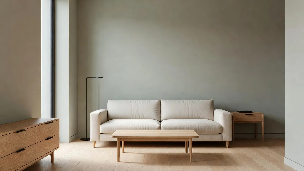
Evergreen Fog has a Light Reflectance Value of 30, making it a medium-dark shade that absorbs substantial light. Its undertones blend cool slate gray with a quiet hint of blue-green. Because it sits firmly in the mid-tone category, it does not wash out under intense halogen or natural sunlight.
When to Use It
This shade works best in spaces with abundant natural southern or western light. It creates a grounded, sophisticated backdrop when paired with warm alabaster trim, brushed brass cabinet handles, and natural walnut wood accents. It is also a prime candidate if you are planning bold accent wall paint ideas in a bedroom or dining space.
The Major Limitation
Do not put Evergreen Fog in a small room with a single north-facing window unless you want a moody atmosphere. In cold northern sunlight, the gray undertones take over, turning the paint into a somber charcoal-sage that makes tight spaces feel smaller and colder.
Is Sea Salt a Sherwin-Williams paint color?
Yes, Sea Salt (SW 6204) is an iconic Sherwin-Williams paint color known for its chameleon-like ability to shift between green, blue, and gray. It is arguably the most famous soft green in the entire Sherwin-Williams historic catalog.
LRV and Undertones
Sea Salt carries an LRV of 63, meaning it reflects almost two-thirds of the light that hits it. Its base combines pale green with distinct blue and cool gray undertones. In high-illumination areas, it acts as a tinted neutral rather than a saturated green.
When to Use It
Sea Salt shines in bathrooms, laundry rooms, and coastal bedrooms where you want a spa-like feel. It contrasts beautifully against stark white trim (like SW High Reflective White) and light-toned quartz countertops.
The Major Limitation
The dealbreaker with Sea Salt is its unpredictable blue shift. If your room faces direct afternoon light or sits next to a blue swimming pool exterior, Sea Salt can completely lose its green base and look like a muted sky blue. If you specifically need a green that stays green under all lighting conditions, Sea Salt will frustrate you.
Is Oyster Bay a popular Sherwin-Williams green?
Yes, Oyster Bay (SW 6206) is a very popular slate-green shade that sits on the same color strip as Sea Salt and Comfort Gray. It provides the soothing undertones of Sea Salt but adds much greater depth and grounding weight.
LRV and Undertones
Oyster Bay has an LRV of 44, positioning it as a true mid-tone neutral. Its undertones are heavy on gray and blue-slate, which keeps the green pigment from feeling too grassy or bright.
When to Use It
I recommend Oyster Bay for dining rooms, home offices, and exterior shutters or front doors. It has enough color payoff to stand up against stark exterior light without looking washed out. If you are researching exterior palettes, combining Oyster Bay with creamy body paints is a proven formula covered in our guide to sherwin-williams exterior paint color combinations.
The Major Limitation
Oyster Bay requires contrast to keep from looking muddy. If you pair it with dark slate floor tiles or deep gray upholstery, the room will look flat and lifeless. You need warm wood, crisp white trim, or metallic accents to bring out its greenish-slate beauty.
Is Clary Sage a popular Sherwin-Williams green?
Yes, Clary Sage (SW 6178) is a popular herbal green paint color favored for traditional and farmhouse interior styles. Unlike gray-heavy greens, Clary Sage embraces a soft, botanical warm base.
LRV and Undertones
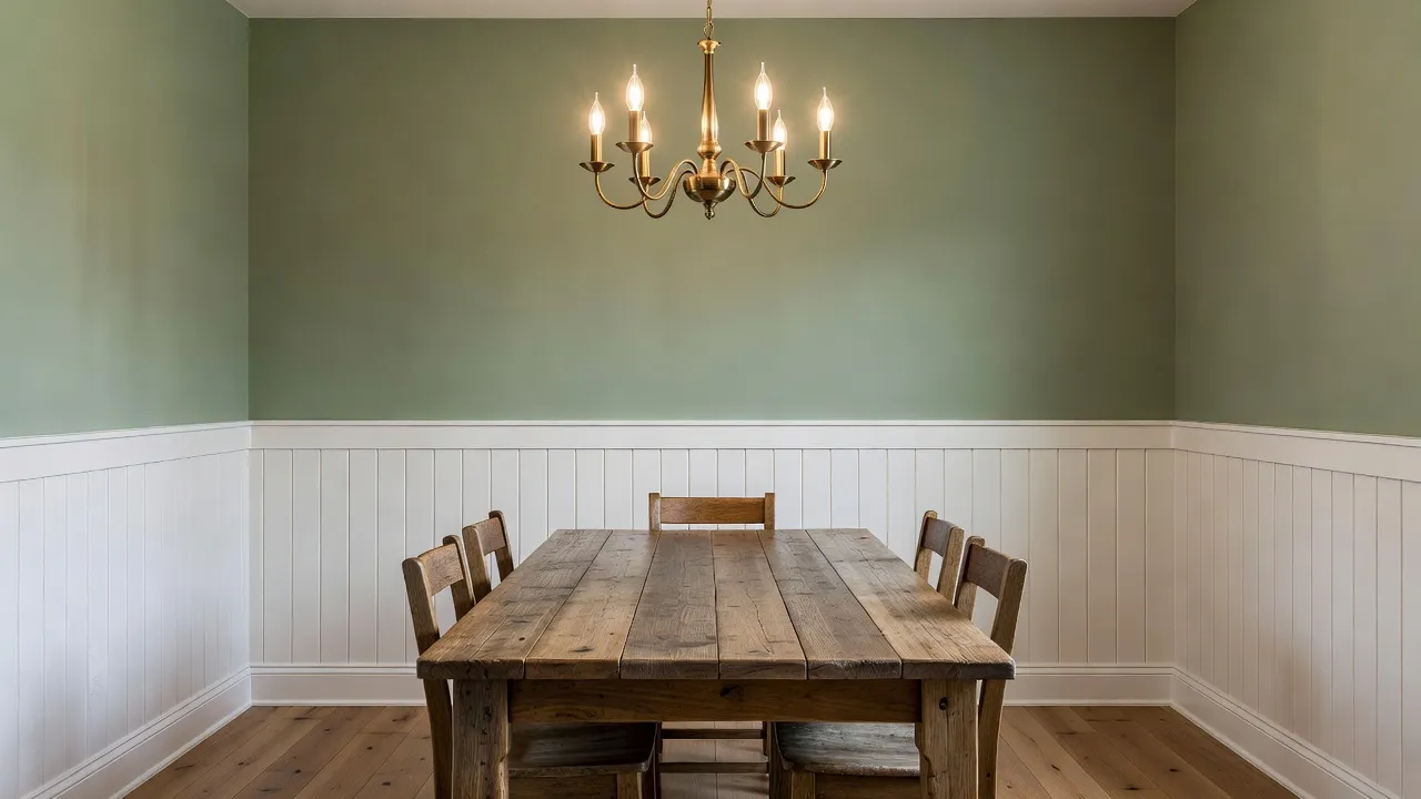
Clary Sage has an LRV of 41, giving it a rich, cozy presence on the wall. Its undertones are noticeably yellow and beige, giving it a muted herbal quality reminiscent of dried sage leaves.
When to Use It
Clary Sage is ideal if your home features warm finishes like honey oak flooring, terracotta tiles, or warm linen drapery. It brings a cozy, cottage-core feel to kitchens, mudrooms, and entryway corridors.
The Major Limitation
The yellow-beige undertone in Clary Sage makes it extremely sensitive to artificial light bulbs. Under standard 2700K warm incandescent or LED lighting, Clary Sage can shift into a murky yellow-brown. You must upgrade your lighting to 3000K or 3500K neutral white daylight bulbs to keep the green crisp according to The Spruce's interior lighting guide.
Is Comfort Gray a Sherwin-Williams green paint color?
Yes, Comfort Gray (SW 6205) is a Sherwin-Williams green paint color despite having "Gray" in its official name. It sits directly between Sea Salt (SW 6204) and Oyster Bay (SW 6206) on the Sherwin-Williams color fan deck.
LRV and Undertones
Comfort Gray features an LRV of 54, offering a balanced mid-light density. It is essentially a darker, slightly more gray-dominant version of Sea Salt. The blue-green undertones are tempered by a heavy injection of neutral slate.
When to Use It
Comfort Gray is the ideal pick when Sea Salt feels too light and washed out, but Oyster Bay feels too dark. It works seamlessly in open-concept floor plans, hallway transitions, and primary suites where consistent, calm color flow is required.
The Major Limitation
Comfort Gray will clash instantly with warm golden oak trim or pink-undertone beige carpets. Its cool slate-blue green base demands cool white trim, charcoal accents, or natural light-to-medium oak finishes to look intentional.
Is Liveable Green a popular Sherwin-Williams green?
Yes, Liveable Green (SW 6176) is a popular neutral green that functions almost like a warm greige. It is frequently chosen by builders and interior designers who want an organic touch without committing to an obvious green hue.
LRV and Undertones
Liveable Green has a high Light Reflectance Value of 61, making it light, airy, and forgiving. Its undertones are gray and warm cream, rendering it one of the least aggressive green paints in the Sherwin-Williams collection.
When to Use It
This color is perfect for whole-house wall painting, low-light entry hallways, and small bedrooms. It provides just enough green pigment to feel intentional while reflecting light effectively in windowless or east-facing spaces.
The Major Limitation
In bright, south-facing rooms with full sunlight, Liveable Green can wash out completely into a dull off-white. If your goal is to have guests walk into a room and instantly notice "green walls," Liveable Green will disappoint you because it disguises itself as a neutral beige-gray in high light.
How to Test Sherwin-Williams Green Colors Before Buying Paint
The single biggest mistake homeowners make when selecting paint is relying on small paper color swatches under store fluorescent lights. Paint colors shift continuously throughout the day as natural sunlight rotates across your home.

To avoid spending hundreds of dollars on paint cans that end up looking wrong on your walls, follow this structured sampling method:
- Narrow down your options to three colors: Choose one light (e.g., Sea Salt or Liveable Green), one mid-tone (e.g., Comfort Gray or Clary Sage), and one deep accent (e.g., Evergreen Fog or Oyster Bay).
- Use an instant AI room visualizer: Before buying physical paint cans, snap a photo of your space and upload it to the Renova AI app on the App Store. Use the wall repaint feature to instantly test different green hues across your exact room layout without touching a brush or doing manual editing.
- Paint large poster board samples: Apply two coats of actual paint sample onto 12x12 peel-and-stick boards or poster boards rather than painting directly on your current wall color.
- Move the boards around the room: Move the sample boards across all four walls over a 24-hour period. Observe how the shade looks at 8:00 AM in natural morning light, 2:00 PM in direct sun, and 8:00 PM under artificial lamps.
Frequently Asked Questions
What is the most popular Sherwin-Williams sage green color?
Evergreen Fog (SW 9130) and Clary Sage (SW 6178) are the two most popular sage greens from Sherwin-Williams. Evergreen Fog offers a cool, gray-slate sage tone, while Clary Sage provides a warmer, herbal sage appearance with yellow undertones.
Does Sea Salt look green or blue on the wall?
Sea Salt (SW 6204) looks green-gray in cool or north-facing light, but flashes noticeably blue in bright south-facing sunlight. It is a chameleon color whose appearance depends heavily on room lighting and exterior reflections.
Is Comfort Gray darker than Sea Salt?
Yes, Comfort Gray (SW 6205) is one shade darker than Sea Salt on the same Sherwin-Williams color strip. Sea Salt has an LRV of 63, while Comfort Gray has an LRV of 54, giving it deeper color saturation and gray undertones.
Which Sherwin-Williams green is best for north-facing rooms?
Liveable Green (SW 6176) and Clary Sage (SW 6178) perform best in north-facing rooms. Their warm beige and yellow undertones help counteract the cold, blue quality of northern sunlight, keeping the space from looking dingy.
What white trim color pairs best with Sherwin-Williams green paint?
Pure White (SW 7005) and Alabaster (SW 7008) pair exceptionally well with popular green paints. Pure White provides a crisp, modern contrast without feeling sterile, while Alabaster adds a soft, warm boundary that complements muted olive and sage tones.
How do I know if a green paint color is too dark for my space?
Check the paint's Light Reflectance Value (LRV). If a room has limited windows or small light sources, paint colors with an LRV below 40 (such as Evergreen Fog at LRV 30) will absorb ambient light and make the room feel noticeably smaller and darker.
Can I use soft green colors as a whole-house neutral?
Yes, desaturated greens with high Light Reflectance Values like Liveable Green (SW 6176) or Sea Salt (SW 6204) work remarkably well as whole-house neutrals. They deliver a serene, organic atmosphere that pairs seamlessly with wood, stone, and neutral textiles.