
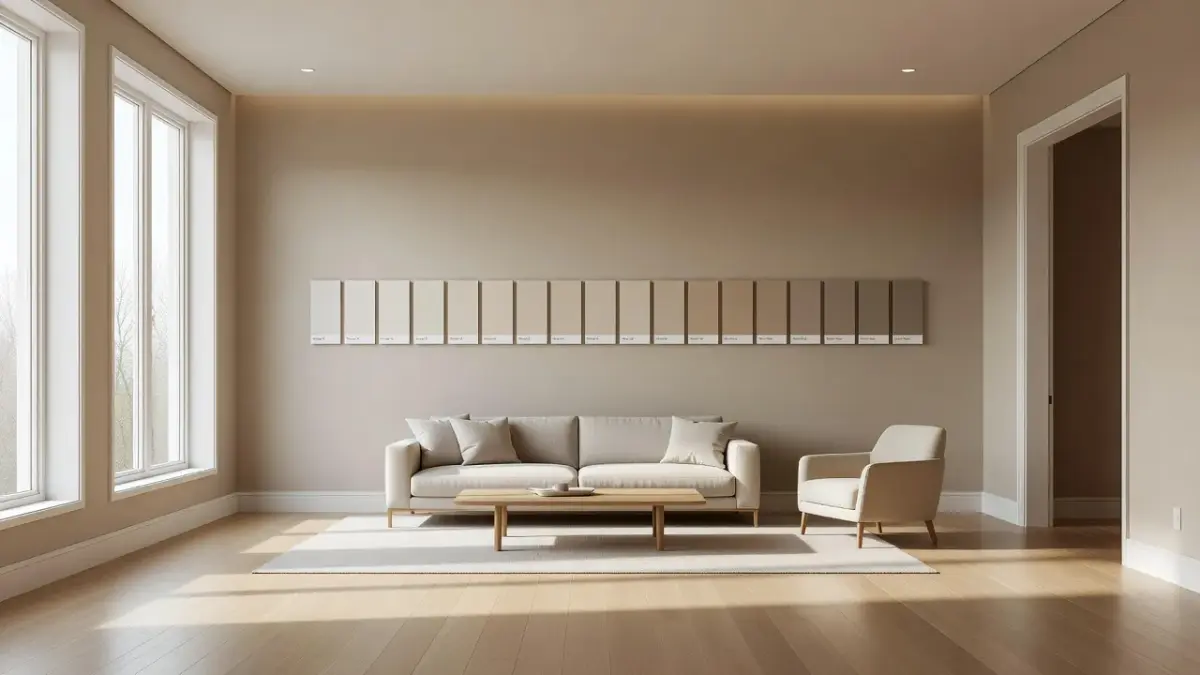
The most popular Sherwin-Williams gray paint colors are Agreeable Gray (SW 7029), Repose Gray (SW 7015), Mindful Gray (SW 7016), Dorian Gray (SW 7017), and Passive (SW 7064). Designers regularly select these specific shades because their Light Reflectance Values (LRV) range between 39 and 60, making them adaptable across diverse architectural lighting conditions. Selecting the correct shade requires visualizing how ambient daylight shifts gray undertones throughout the day. To test wall shades digitally on your phone before spending money on sample tins, our iPhone app Renova AI lets you repaint walls and swap room colors without manual editing.
Which Sherwin-Williams gray colors do designers recommend?
Designers consistently recommend Sherwin-Williams grays that balance warm taupe or beige undertones with cool blue or green bases to prevent rooms from looking sterile. Neutral gray paint colors are divided into two primary categories: warm grays (often called "greiges") and cool grays. Choosing between them depends on your room's orientation to natural light and the warmth of your existing flooring or cabinetry.
When top interior decorators select grays, they look at four key technical traits:
- Light Reflectance Value (LRV): A scale from 0 (absolute black) to 100 (pure white) measuring how much light a paint color reflects.
- Underlying Pigment Base: The hidden violet, green, blue, or yellow pigments that surface under artificial LED or tungsten bulbs.
- Room Orientation: North-facing light pulls out cool blue tones, while warm South-facing light amplifies warm beige undertones.
- Fixed Finishes: The colors of immovable room features like hardwood floors, granite countertops, and brick fireplaces.
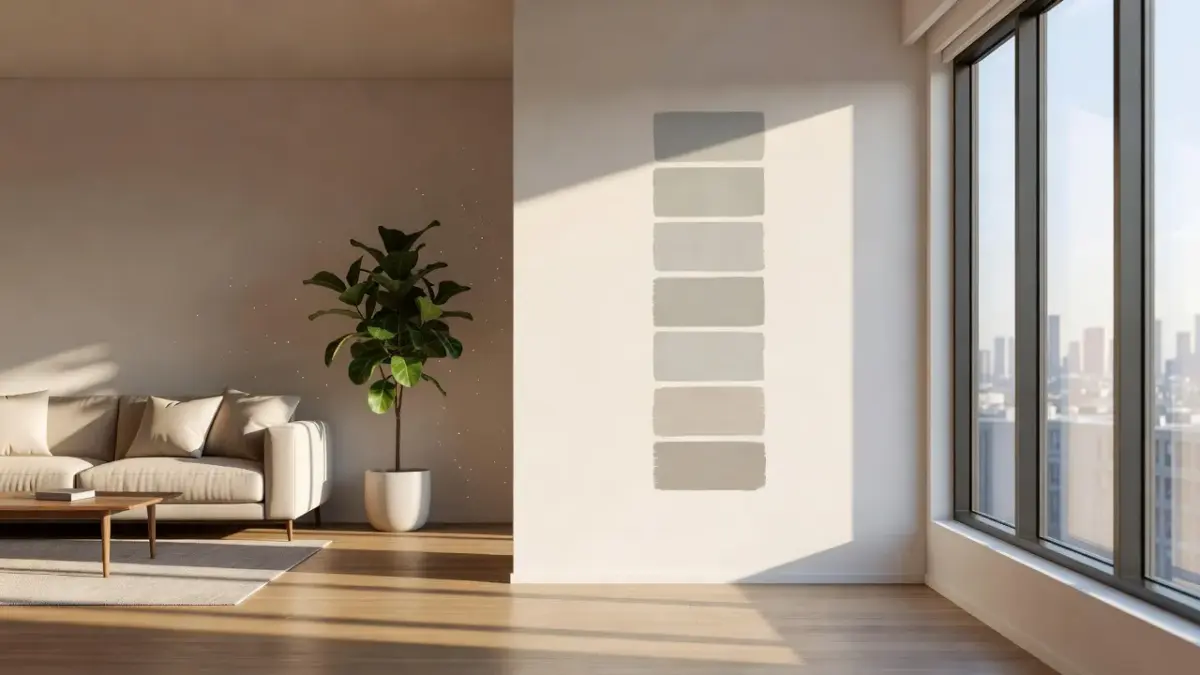
Picking the wrong gray usually happens when homeowners pick a swatch under bright store lighting without calculating how evening light changes the shade. If you pick a cool gray for a North-facing room with blue light, your walls can easily feel like a cold concrete basement. Conversely, applying a warm greige in a hot South-facing space can make the walls look muddy yellow.
If you are coordinating gray walls with adjacent warm paint shades, exploring complementary guides like our breakdown of Sherwin Williams Shiitake paint color provides a solid foundation for building cohesive warm-neutral palettes.
Is Agreeable Gray a popular Sherwin-Williams gray?
Yes, Agreeable Gray (SW 7029) is Sherwin-Williams' top-selling paint color overall due to its ideal balance of gray and beige. Classified as a true greige, Agreeable Gray features a Light Reflectance Value of 60, making it bright enough to bounce daylight through darker hallways while retaining enough pigment to contrast cleanly against white baseboards.
According to technical paint data on the official Sherwin-Williams color catalog, SW 7029 sits right at the threshold where warm neutrals meet cool neutrals. Its subtle taupe undertone prevents it from flashing cold blue or green under neutral LED lighting.
- Best Room Applications: Open-concept living areas, entryways, bedrooms, and resale property refreshes.
- Primary Undertones: Warm beige, subtle grey-brown taupe.
- Best Trim Pairings: Sherwin-Williams Pure White (SW 7005) or Extra White (SW 7006).
- Key Trade-Off: In dim, windowless rooms with warm lighting, Agreeable Gray can occasionally look somewhat beige rather than modern gray.
Because it bounces plenty of light without washing out, real estate stagers and custom builders treat Agreeable Gray as their baseline wall color. It bridges the gap between traditional oak wood trim and contemporary marble finishes.
If you want to review historical color trends alongside modern greiges, you can read our guide on Sherwin Williams historic colors to see how warm neutrals have evolved over time.
Is Repose Gray SW 7015 a popular Sherwin-Williams gray?
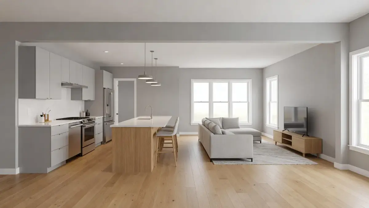
Yes, Repose Gray SW 7015 is widely considered Sherwin-Williams' second most popular gray color, known for being slightly cooler and less beige than Agreeable Gray. With an LRV of 58, Repose Gray is dark enough to offer clear contrast against trim while maintaining strong light reflection throughout open floor plans.
Documentation on Sherwin-Williams paint specifications identifies Repose Gray as a soft gray containing tiny hints of green and taupe. These undertones anchor the color, keeping it from feeling icy while keeping it distinctly gray rather than beige.
- Best Room Applications: Modern farmhouses, kitchens with white quartz countertops, and bathrooms.
- Primary Undertones: Soft gray with faint taupe, violet, and green undertones.
- Best Trim Pairings: High Reflective White (SW 7757) or Alabaster (SW 7008).
- Key Trade-Off: In low North-facing light, the hidden green-violet undertones can occasionally surface as a muted purple shadow.
When comparing Agreeable Gray to Repose Gray, the difference comes down to warmth. Agreeable Gray leans slightly toward beige, whereas Repose Gray leans distinctly toward true gray. If your room features cool-toned tile or dark slate, Repose Gray is generally the safer aesthetic pick.
| Paint Color / Tool | Best Suited Reader / Application | LRV | Primary Undertones | Key Trade-Off |
|---|---|---|---|---|
| Agreeable Gray (SW 7029) | Homeowners wanting maximum warmth and universal resale appeal | 60 | Taupe, Beige | Can appear overly beige under warm 2700K lighting |
| Renova AI App | Homeowners testing paint shades digitally before buying samples | N/A | Full Digital Palette Visualizer | Requires iOS device to run the wall recoloring app |
| Repose Gray (SW 7015) | Decorators seeking a true greige with minimal brown tones | 58 | Soft Gray, Violet, Green | Can flash cool purple in shadowy North-facing rooms |
| Mindful Gray (SW 7016) | Spaces needing strong contrast against thick white trim | 48 | Greige, Brown, Stone | Too dark for small, windowless rooms without bright fixtures |
| Dorian Gray (SW 7017) | Accent walls, exterior trim, and deep architectural features | 39 | Deep Greige, Warm Charcoal | Reduces perceived room volume if applied on all four walls |
| Passive (SW 7064) | Modern interiors with cool marble, slate, and stainless steel | 60 | Cool Blue, True Slate | Feels stark or chilly when paired with warm honey oak wood |
Is Mindful Gray a popular Sherwin-Williams gray?
Yes, Mindful Gray (SW 7016) is a very popular medium-toned gray that provides significantly more depth and saturation than light greiges. Sitting directly below Repose Gray on the paint swatch strip, Mindful Gray has an LRV of 48, placing it firmly in the mid-tone category.
Because an LRV of 48 reflects less than half of incoming light, as defined by the Wikipedia Light Reflectance Value index, Mindful Gray absorbs ambient shadows without disappearing into the background. It is rich enough to anchor dining rooms, home offices, and kitchen cabinets.
- Best Room Applications: Kitchen islands, lower cabinetry, accent walls, and sun-filled bedrooms.
- Primary Undertones: Greige with grounding brown and warm stone undertones.
- Best Trim Pairings: Eider White (SW 7014) or Pure White (SW 7005).
- Key Trade-Off: Requires adequate natural or artificial light; otherwise, it can make small rooms feel compact.
If your home gets intense Southern sunlight that washes out lighter shades like Agreeable Gray, Mindful Gray maintains its visual weight. It creates a cosy, grounded atmosphere while staying neutral enough to match accent rugs and woven wood shades.
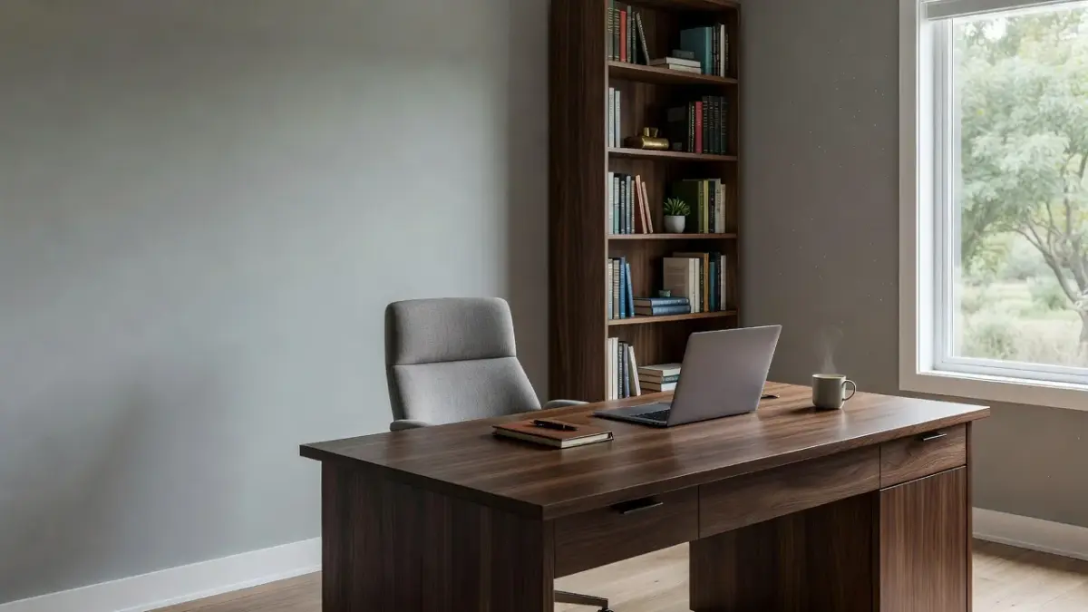
How to Preview Sherwin-Williams Grays Before Painting Your Room
The safest way to choose between popular gray paint colors is to test them directly on your walls using digital visualizers and physical peel-and-stick swatches. Skipping the preview stage is the primary reason paint projects fail, as digital screen renderings differ from actual dry paint finishes.
Rather than buying half a dozen sample pots, painting wet patches, and repainting primer later, you can preview wall colors on your mobile device. Using our iPhone app Renova AI, you snap a picture of your bedroom or kitchen and let the tool repaint the walls, change the colors, and swap the floors without manual editing required at all.
To test wall shades effectively in real life, follow this three-step workflow:
- Generate Digital Previews: Upload a photo to Renova AI to narrow down your selection between warm greiges and cool slate grays.
- Order Peel-and-Stick Samples: Place large stick-on paint samples on white poster board rather than directly on existing painted walls.
- Observe Across Light Shifts: Check the swatches at 8:00 AM, 1:00 PM, and 8:00 PM with your room's lamps turned on.
If you are exploring color options beyond gray, you can also check our guide on Sherwin Williams Upward paint color to see how soft blue-grays compare against neutral mid-tones.
Is Dorian Gray a popular Sherwin-Williams gray?
Yes, Dorian Gray (SW 7017) is a widely recommended deep gray that excels on interior accent walls, home exteriors, and doors. With an LRV of 39, Dorian Gray is a darker cousin to Repose Gray and Mindful Gray, delivering rich depth without drifting into black or charcoal.
Dorian Gray features prominent taupe and warm greige undertones. It matches well with exterior stone facades, white board-and-batten siding, and dark bronze light fixtures.
- Best Room Applications: Exterior siding, front doors, kitchen cabinetry, fireplaces, and accent walls.
- Primary Undertones: Warm greige, stone gray, and brown-taupe.
- Best Trim Pairings: Alabaster (SW 7008) or Snowbound (SW 7004).
- Key Trade-Off: Absorbs substantial light, making it too heavy for small powder rooms or dark corridors.
When applied to trim or kitchen cabinets, Dorian Gray creates an upscale contrast against off-white walls. Exterior paint recommendations from the US Green Building Council emphasize choosing durable exterior finishes with balanced LRVs to manage heat absorption while maintaining curb appeal.
Is Passive a popular Sherwin-Williams gray?
Yes, Passive (SW 7064) is a popular cool gray color chosen by designers who want a crisp, modern slate feel without any beige or yellow. Featuring an LRV of 60, Passive reflects plenty of light while clearly signaling a cool, urban color palette.
Unlike Agreeable Gray or Repose Gray, Passive belongs to Sherwin-Williams' cool neutral family. Its undertones lean subtly toward blue and true gray, making it ideal for contemporary spaces with modern fixtures.
- Best Room Applications: Bathrooms with marble tile, ultra-modern living rooms, and bright spaces with direct Southern sunlight.
- Primary Undertones: Cool blue, slate gray, and crisp icy undertones.
- Best Trim Pairings: Extra White (SW 7006) or Bright White trim.
- Key Trade-Off: Can look cold or hospital-like in rooms with dim North-facing natural light.
If your floor plan features cool gray quartz, stainless steel appliances, and black matte hardware, Passive ties those elements together smoothly. However, if your home contains warm cherry or honey oak flooring, Passive will clash against the warm wood tones.
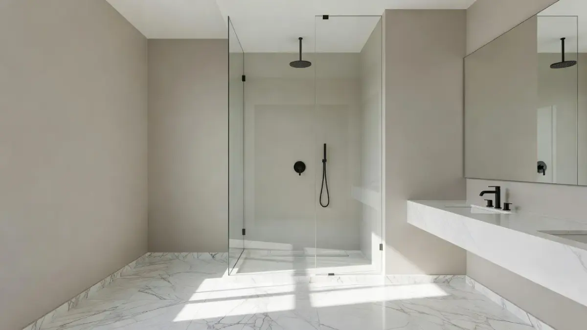
What most people get wrong when picking gray paint (and what it costs)
The most common mistake when choosing gray paint is picking a color based on a paper swatch under retail store lights, which ruins room warmth and wastes money. A shade that looks like a clean, modern gray under store bulbs can turn lavender or dull mud on your bedroom walls.
The costs of selecting the wrong paint shade add up quickly:
- Wasted Material Costs: A single gallon of premium Sherwin-Williams interior acrylic paint averages $65 to $85.
- Pro Painter Fees: Re-priming and repainting a 12x15 room typically costs $400 to $800 in labor.
- Time Lost: Fixing a botched color choice takes a full weekend of prep, taping, and double-coating.
To prevent costly repainting projects, review general color coordination guides like our article on living room wall colors before committing to a final color family.
Failing to calculate Light Reflectance Value (LRV)
Ignoring LRV is a frequent color mistake. Painting a dark gray with an LRV of 35 in a room with a single tiny window makes the space feel restricted. Conversely, using a high-LRV light gray (LRV 65+) in an overly sunlit South-facing room can cause harsh glare.
Aim for an LRV between 55 and 62 for main living walls. Keep darker shades (LRV below 45) for accent zones, vanities, or spaces with heavy artificial ambient lighting.
Clashing with fixed room undertones
Walls do not exist in isolation. Your flooring, kitchen counters, and fireplace stone have fixed undertones that cannot be changed without expensive renovations.
Pairing a cool gray like Passive with warm yellow-oak flooring creates visual friction. Matching warm greiges like Agreeable Gray with warm flooring keeps the interior cohesive and balanced.
Frequently Asked Questions
What is the most popular Sherwin-Williams gray paint color?
Agreeable Gray (SW 7029) is Sherwin-Williams' most popular gray paint color overall. Its balanced warm greige composition allows it to adapt across almost all residential lighting conditions and wood trim finishes.
What is the difference between Agreeable Gray and Repose Gray?
Agreeable Gray (SW 7029) is slightly warmer with stronger beige undertones and an LRV of 60. Repose Gray (SW 7015) has an LRV of 58 and leans cooler with subtle violet and green-gray undertones.
Is cool gray or warm gray better for living rooms?
Warm gray (greige) is generally better for living rooms because it creates an inviting atmosphere that coordinates easily with wood floors and leather furniture. Cool grays work best in modern spaces with abundant natural sunlight or marble finishes.
Which Sherwin-Williams gray has no undertones?
No paint color is completely free of undertones, but Light French Gray (SW 0055) is regarded as one of the closest options to a neutral, true gray. It displays minimal yellow, pink, or green flashes under standard 3000K daylight LED bulbs.
How do I stop gray paint from looking blue or purple?
Avoid cool grays with low LRVs in North-facing rooms, where cool natural daylight exaggerates blue pigments. To prevent a blue or purple cast, select warm greiges like Agreeable Gray or Mindful Gray that contain grounding taupe pigments.
What white trim color matches Sherwin-Williams gray paint?
Sherwin-Williams Pure White (SW 7005) and Extra White (SW 7006) are the most versatile trim colors for gray walls. Pure White offers a soft, non-yellow warmth, while Extra White provides crisp contrast against mid-tone grays.