
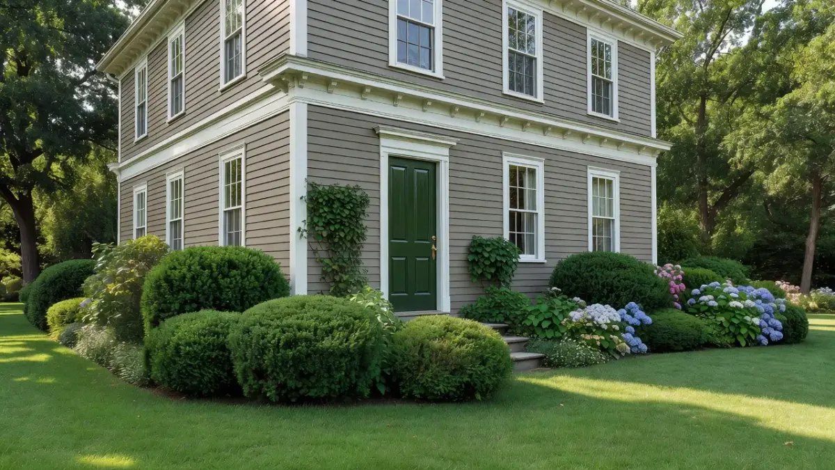
The Sherwin-Williams Historic Color Collection features 120 period-accurate paint shades drawn from historic American architecture, led by top picks like Downing Stone (SW 2821), Chelsea Gray (SW 2850), and Rookwood Red (SW 2802). Organized by architectural movement—including Colonial, Victorian, Arts & Crafts, and 20th-Century Revival—these shades preserve historical authenticity while offering predictable Light Reflectance Values (LRV) for modern homes.
Choosing the right paint for an older home comes down to one primary variable: architectural era and light reflection. If you put a Victorian shade on a Mid-Century bungalow, the undertones usually clash with the home's low rooflines and natural timber. I always advise homeowners to start by identifying their property's exact building style before picking paint chips.
Whether you are restoring a registered historic landmark or bringing classic warmth to a suburban build, matching period colors requires balancing historical accuracy with modern lighting conditions. You can preview how historical shades match your exterior architecture using our exterior house paint colors guide before applying physical paint samples.
What is the Sherwin-Williams Historic Color Palette?
The Sherwin-Williams Historic Color Collection is a specialized system of 120 paint colors formulated to match original interior and exterior pigments from 18th, 19th, and early 20th-century American architecture. Developed in partnership with preservation societies, the collection groups shades into distinct design eras rather than basic hue families.
Sherwin-Williams originally documented these colors by analyzing paint layer cross-sections from historical sites across the United States. According to the National Park Service Historic Preservation Standards, maintaining accurate exterior color schemes is a key factor in protecting architectural integrity during building rehabilitation.
The collection covers five main architectural movements:
- Colonial & Federal (1700s–1830s): Earth-derived ochers, muted blues, deep iron oxides, and soft whitewashes.
- Victorian & Eastlake (1840s–1900s): Complex multi-tone palettes featuring deep plums, rich olives, mustard golds, and dark reds.
- Arts & Crafts / Craftsman (1890s–1920s): Nature-inspired tones including deep browns, forest greens, muted terracotta, and warm stone grays.
- Period Revivals (1920s–1940s): Colonial Revival tans, Georgian greens, and muted grays tailored for suburban housing booms.
- Mid-Century & Modern (1950s–1970s): Cleaner primaries, muted aqua tones, avocado greens, and neutral foundation whites.
Top 9 Sherwin-Williams Historic Colors Ranked
1. Downing Stone (SW 2821)
Downing Stone is a warm, mid-tone greige with a Light Reflectance Value (LRV) of 37 that serves as an anchor neutral for Victorian and Arts & Crafts exteriors. It blends gray, brown, and subtle green undertones, preventing it from looking flat under direct sunlight.
- Why it made the list: It is easily the most versatile neutral in the historic catalog, bridging the gap between cool gray and warm taupe.
- Best application: Exterior siding, grand living room walls, or historic wainscoting.
- Key trade-off: In north-facing rooms with cool light, the green undertone comes forward and can make small spaces feel chilly.
2. Chelsea Gray (SW 2850)
Chelsea Gray is a rich, complex slate gray with an LRV of 29 designed for high-contrast historic body and trim applications. Unlike modern cool grays, it relies on warm brown earth pigments to keep it tied to traditional stone masonry.
- Why it made the list: It provides dramatic architectural depth without slipping into modern charcoal or stark black.
- Best application: Exterior window sashes, front doors, or cozy historic libraries.
- Key trade-off: Its low LRV absorbs a lot of light, requiring deliberate interior lighting plans with 2700K to 3000K bulbs.
3. Rookwood Red (SW 2802)
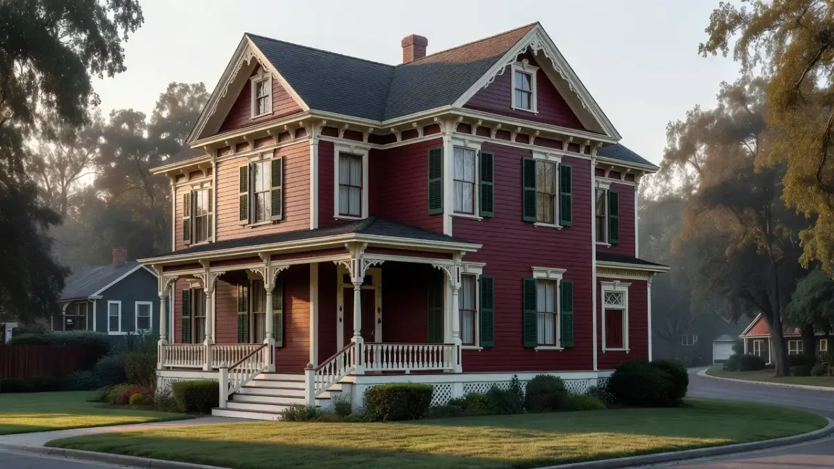
Rookwood Red is a deep, historic iron-oxide red with an LRV of 10 that reflects classic Victorian accent palettes. Inspired by American art pottery, this rich shade adds gravitas to entranceways and exterior details.
- Why it made the list: It is the standard reference shade for historic front doors and Victorian gables across the country.
- Best application: Front doors, shutters, exterior gingerbread trim, or dining room accent walls.
- Key trade-off: Deep reds use transparent pigments, meaning you will need a gray-tinted primer and 3 to 4 coats for full coverage.
4. Renwick Olive (SW 2815)
Renwick Olive is a dark, muted olive green with an LRV of 19 that mimics aged botanical dyes and forest foliage. Named after architect James Renwick, it embodies late 19th-century picturesque design principles.
- Why it made the list: It creates an immediate connection between a home's exterior and its surrounding landscape.
- Best application: Exterior siding on Craftsman bungalows, historic window casings, or moody interior studies.
- Key trade-off: It can make small interior rooms feel dark if you do not pair it with higher-LRV cream trim.
5. Colonial Revival Tan (SW 2828)
Colonial Revival Tan is a warm, golden-wheat tan with an LRV of 48 that captures early 20th-century architectural revivals. It offers significant warmth while maintaining enough gray content to stay grounded.
- Why it made the list: It is one of the safest historic body colors for homeowners who want warmth without turning yellow.
- Best application: Main hallway walls, open living spaces, and full exterior clapboard siding.
- Key trade-off: Standard 3000K warm LED bulbs can make this shade look overly yellow in windowless rooms. If you want to explore similar warm earthy hues, read our breakdown of Sherwin-Williams Retreat paint color for complementary sage and slate palettes.
6. Arts & Crafts Goldenrod (SW 2820)
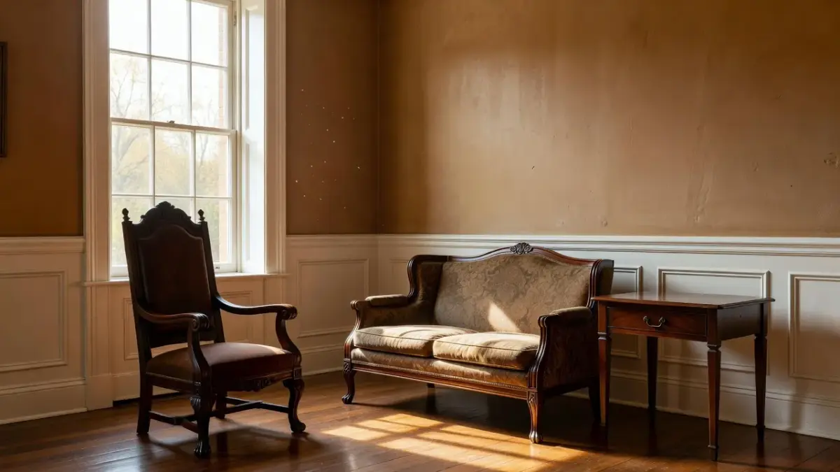
Arts & Crafts Goldenrod is an intense ocher-yellow with an LRV of 36 that echoes hand-dyed textiles and earthen tilework. It brings an optimistic, historic energy into living spaces without the sharp brightness of modern yellow paint.
- Why it made the list: It delivers accurate turn-of-the-century character that modern bright yellows cannot replicate.
- Best application: Dining rooms, kitchen cabinetry, or accent panels on Craftsman exteriors.
- Key trade-off: It limits your interior accent colors—cool blue or purple furnishings will clash immediately.
7. Heritage Rose (SW 2840)
Heritage Rose is a dusty, muted mauve-pink with an LRV of 41 sourced from mid-Victorian interior parlor historical records. It provides a warm background glow that flatters antique woodwork and brass fixtures.
- Why it made the list: It offers a historically accurate pink option that feels sophisticated rather than juvenile.
- Best application: Victorian bedrooms, historic parlors, or powder room ceilings.
- Key trade-off: It reads very traditional and can look out of place alongside sleek chrome or modern minimalist decor.
8. Classical Yellow (SW 2829)
Classical Yellow is a buttery, bright cream-yellow with an LRV of 64 inspired by Federal and Georgian exterior estates. It mimics yellow ochre whitewashes used on historic masonry and timber framing.
- Why it made the list: It brightens large exterior facades without looking harsh under direct sunlight.
- Best application: Historic home exteriors, sunny breakfast nooks, and entry foyers.
- Key trade-off: Its high LRV can wash out under strong noon sun, making the yellow look pale white on south-facing exterior walls.
9. Preservation White (SW 2801)
Preservation White is a soft off-white trim shade with an LRV of 74 formulated to resemble aged lime wash and natural lead pigments. It provides a gentle contrast against historic body shades without the harsh glare of modern pure white.
- Why it made the list: Modern bright white paint distorts historical palettes; Preservation White keeps color schemes grounded.
- Best application: Interior trim, baseboards, window sashes, doors, and exterior woodwork across all historic styles.
- Key trade-off: If paired with modern white quartz countertops or stark white appliances, it can look slightly dingy.
Comparing the Top Sherwin-Williams Historic Colors
The table below breaks down the specs, period origins, and ideal pairings for the top Historic Collection options.
| Paint Color | LRV | Architectural Era | Primary Undertone | Key Trade-Off |
|---|---|---|---|---|
| Downing Stone (SW 2821) | 37 | Arts & Crafts / Victorian | Warm Gray-Green | Can read cool in north-facing light |
| Chelsea Gray (SW 2850) | 29 | Victorian / Classical | Earthy Slate Gray | Low light reflection requires bright light |
| Rookwood Red (SW 2802) | 10 | Victorian / Eastlake | Deep Iron Oxide | Requires gray primer and 3+ coats |
| Renwick Olive (SW 2815) | 19 | Colonial Revival / Craftsman | Dark Forest Olive | Absorbs room light quickly |
| Colonial Revival Tan (SW 2828) | 48 | Early American / Colonial | Golden Wheat | Warm light bulbs amplify yellow tones |
| Arts & Crafts Goldenrod (SW 2820) | 36 | Arts & Crafts | Earthen Ocher | Difficult to pair with cool modern accents |
| Heritage Rose (SW 2840) | 41 | Mid-Victorian Interior | Dusty Mauve-Pink | Clashes with modern metallic fixtures |
| Classical Yellow (SW 2829) | 64 | Federal / Georgian | Butter Cream | Washes out on south-facing exterior walls |
| Preservation White (SW 2801) | 74 | Universal Historic Trim | Aged Lime Cream | Looks off-white next to modern quartz |
How Historic Preservation Guidelines Impact Paint Choices
If your property sits inside a local Historic Preservation District (HPC), your paint choices are often restricted to documented historical palettes. Municipal commissions usually enforce strict rules on exterior body colors, trim contrast ratios, and sheen levels to keep the neighborhood cohesive.
As of October 2026, most local preservation boards require homeowners to submit paint chip samples or digital mockups before painting exterior surfaces. According to guidelines from the National Trust for Historic Preservation, applying historically inaccurate paints to original brick or stone can also lock in moisture, causing long-term masonry damage.
When navigating historic district approvals, keep these core principles in mind:
- Maintain Masonry Permeability: Never paint original unpainted brick or brownstone without commission approval. Use breathable silicate or mineral paints where required.
- Match the Era: A 1920s Craftsman home usually requires earth tones (greens, browns, warm stones), while an 1880s Queen Anne Victorian can support multi-tone palettes with up to five contrasting colors. To better understand traditional structural details and palettes, review our detailed guide on colonial interior design styles.
- Respect Sheen Standards: Historic exteriors almost always call for flat or low-lustre finishes on siding, reserving semi-gloss exclusively for doors and window sashes.
How to Test Historic Colors on Your Home
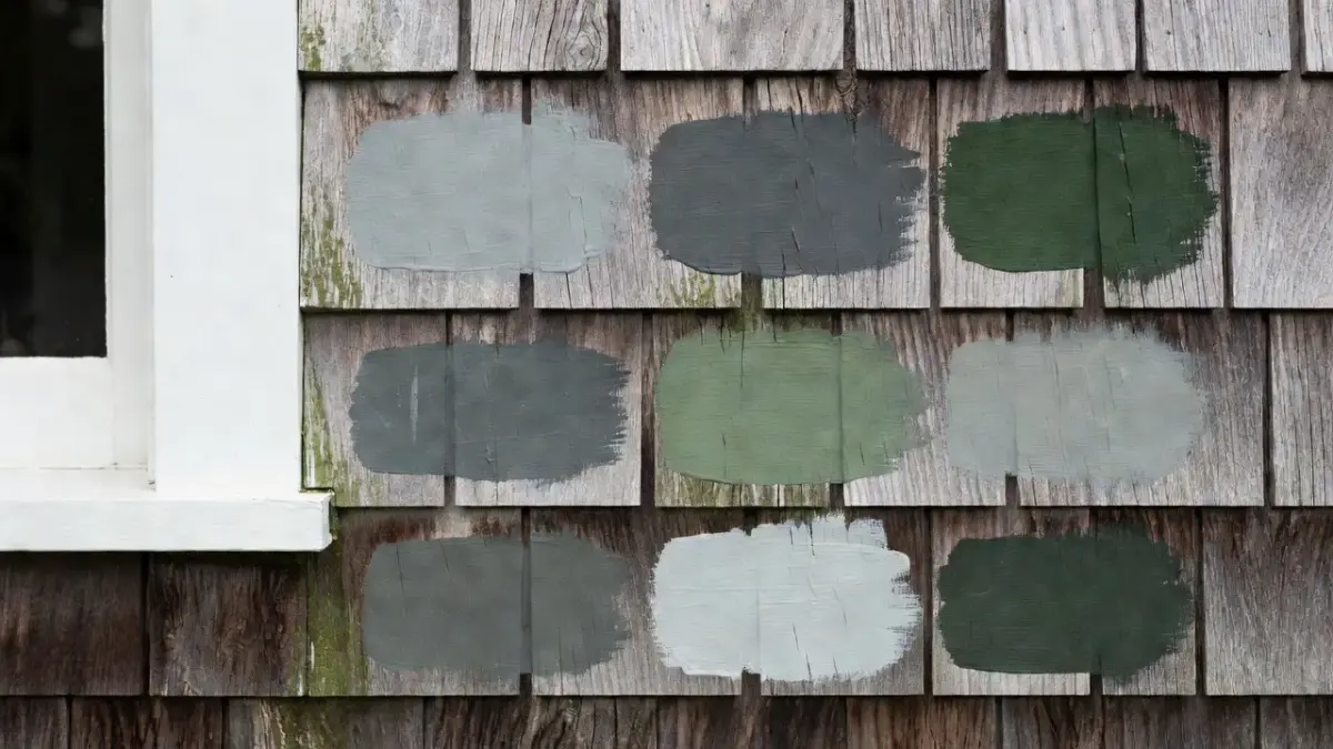
Testing historic colors requires seeing them against your actual trim, architecture, and lighting over 24 hours. Lighting changes dramatically between morning sun and evening shade, which can turn a warm historic beige into a muted green gray.
Here is how the main color-testing methods compare:
| Testing Method | Cost Range | Speed / Setup | Key Advantage | Main Limitation |
|---|---|---|---|---|
| Physical Paper Chips | Free | Instant at store | Quick hue comparison | Too small to gauge room scale |
| Peel-and-Stick Samplers | $6 – $9 each | 2–3 day delivery | Real paint texture, non-damaging | Limited to single wall placement |
| Renova AI Visualizer App | 3 free, then $59/yr | Instant (seconds) | Previews full room and exterior styles on your photo | Color depends on screen brightness |
| Liquid Sample Pots | $10 – $15 per pot | 1–2 hours painting | Exact paint match on real substrate | Requires wall prep and drying time |
As shown above, using an instant tool like the Renova AI app allows you to visualize complete room and exterior transformations on your phone before spending money on sample pots. You can download Renova AI on the App Store to test how historic colors work with your existing flooring and trim.
Visualizing Historic Palettes Digitally Before Painting
Digital visualization tools help you avoid costly repainting mistakes by showing how historic colors fit your home's layout. Traditional paper swatches cover only a few square inches, making it hard to see how a low-LRV shade like Rookwood Red or Chelsea Gray affects an entire facade.
I recommend taking a photos-first approach to color planning:
- Snap Clear Exterior & Interior Photos: Take photos in indirect natural light to capture your home's true trim and wall dimensions.
- Upload to Visualization Software: Use AI layout visualizers like Renova AI to swap wall paint, alter trim colors, and preview historic interior styles without moving furniture.
- Verify with Physical Samples: Once digital mockups confirm your color palette, purchase physical peel-and-stick swatches to verify how local ambient light hits the real paint pigments.
Digital tools give you the freedom to experiment with bold historic accents—like goldenrod doors or olive shutters—risk-free.
Frequently Asked Questions
What is the most popular Sherwin-Williams historic color?
Downing Stone (SW 2821) is widely considered the most popular Sherwin-Williams historic color due to its balanced taupe-gray undertones. It works equally well as a main exterior siding shade and as a warm interior wall neutral across traditional and modern homes.
Are Sherwin-Williams historic colors only for historic homes?
No, Sherwin-Williams historic colors work exceptionally well in modern construction. Because these pigments are rooted in natural earth oxides and historical dyes, they bring warmth, depth, and character to modern open floor plans and modern farmhouse exteriors.
How do I know if my historic color choice meets HPC guidelines?
You can check your municipal Historic Preservation Commission (HPC) website or local design guideline manual. Most commissions maintain an approved color list drawn directly from historic manufacturer collections like Sherwin-Williams, requiring simple administrative review for approval.
What does LRV mean when choosing historic paint colors?
LRV stands for Light Reflectance Value, measuring the percentage of light a paint color reflects on a scale from 0 (pure black) to 100 (pure white). Dark historic colors like Rookwood Red (LRV 10) absorb light, while shades like Classical Yellow (LRV 64) bounce light across the room.
Why do historic colors look different inside versus outside?
Direct sunlight on house exteriors washes out color intensity, making paints appear 10 to 15 percent lighter than they look on interior walls. Cool morning sunlight brings out blue-green undertones, while afternoon sun enhances golden tones.
Do historic exterior paint schemes require high-gloss finishes?
No, historically accurate exterior schemes use flat or satin sheens for wood siding and brick surfaces. High-gloss finishes are traditionally reserved for doors, shutters, and decorative window sashes to highlight architectural detail.
Can I mix colors from different historic eras on one home?
Yes, but you should maintain consistent undertones and saturation levels. Combining a Victorian trim color with a Colonial body shade works best when both colors share warm earth pigments rather than mixing cool modern whites with warm historic tones.